Vasilis Marmatakis talks us through his weird and wonderful designs for The Lobster, Killing a Sacred Deer, and The Favourite


With Greek director Yorgos Lanthimos, the posters are as provocative as the films. For instance, before watching The Killing of a Sacred Deer (2017), the image that fuelled my anticipation was the eerie, mind-boggling one-sheet released for its Cannes premiere. At the time, I couldn’t formulate an explanation. The framing of Colin Farrell, in a hospital, looming over two empty beds, told me hardly anything about the plot. Yet I felt compelled to analyse this solitary image like a magic eye puzzle. Is it a horror? Where’s the deer? Wait, is he the deer? And how did he grow a beard that quickly after The Lobster? Already, my excitement was heightened.
The artist to thank is Vasilis Marmatakis. Since Dogtooth in 2005, Marmatakis has designed the promotional posters for all of Lanthimos’s movies, creating eye-catching images that challenge observers to fill in the blanks. In the early 2000s, Lanthimos did freelance work at the advertising company that employed his future collaborators, Marmatakis and Efthymis Filippou. Filippou would later co-write Dogtooth, Alps, The Lobster and Sacred Deer.
Marmatakis crafted the artwork for these cult oddities, but he also went one further with his involvement on Lanthimos’s new film, The Favourite. The newly released comedy – a twisted period piece starring Emma Stone, Rachel Weisz, Olivia Colman and 17 rabbits – is ultra-mean, malicious fun. But, really, you should have guessed that tone from Marmatakis’s macabre poster.


At an exhibition of his work, Marmatakis talked me through the unused concepts for these films. It’s like discovering a band’s weird, wonderful B-sides – the tracks deemed too experimental for public consumption. A rejected poster for Alps features Everest as its main image. It refers to a line of dialogue about how the Alps could replace another mountain, but no mountain could stand in for the Alps. So to understand the poster, you need to have seen the film and possess a decent knowledge of mountain ranges. “It’s Everest pretending to be the Alps,” Marmatakis laughs. “Marketing were like, ‘No one’s going to get it.’”
Does Marmatakis want the poster to be the first image a viewer sees? “I think it’s an entry to the film,” he says. “It creates the right mind-frame. I found out about films through posters. When I was a kid, I’d get videotapes because of the covers. I discovered cinema, like Dario Argento, through the posters.” Here, Marmatakis gives us a guided tour to a selection of his posters for Lanthimos – including a few concepts that were never officially released.

Yorgos hates explaining his films; he would never say, “this means this”. Are you more relaxed about explaining your designs?
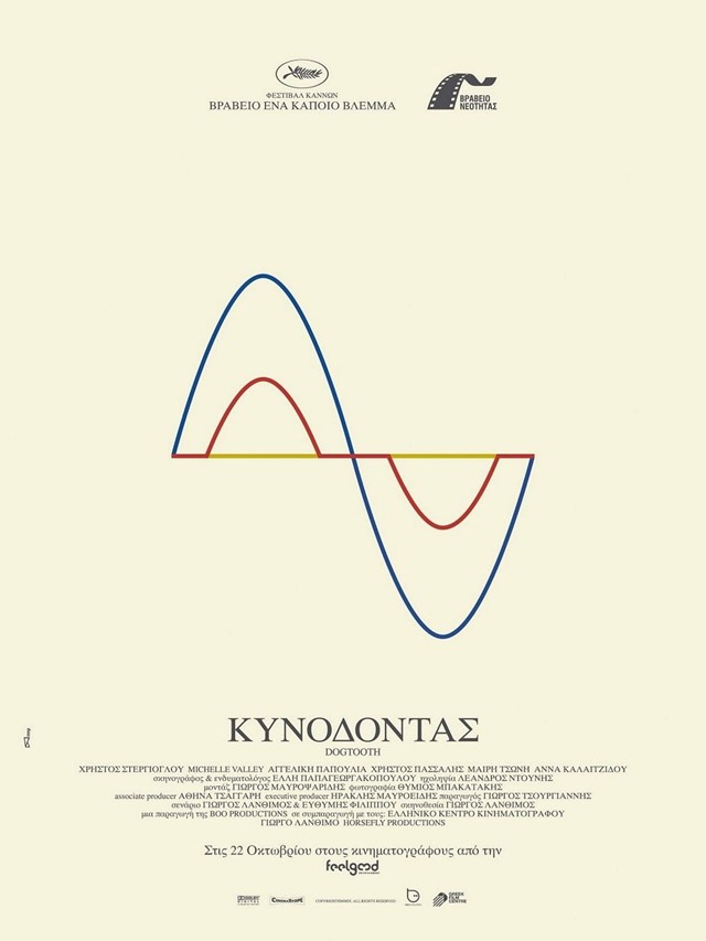
Vasilis Marmatakis: I’m okay with it. So this one (Dogtooth, above) actually came out in Greece. It was for the Cannes Film Festival. Everywhere else, they thought it was too unconventional and weird to have as a film poster. But for us, it made sense, because it’s a distortion – the three kids have a distorted view of the world. It’s three lines. Each one represents a kid. The design was not used anywhere. But in a lot of people’s minds, it’s associated with Dogtooth.
I rewatched Dogtooth last night, and the three lines actually appear in the film.
Vasilis Marmatakis: Exactly! I forgot about that. It’s in the beginning of the film. Those three lines.
A lot of international Dogtooth posters used a still image from the film instead of your design. What makes a literal still image from Dogtooth less representative of the film than one of your designs?
Vasilis Marmatakis: (A still image) doesn’t represent the film, because it’s just one image from the film. If you have a plate of food and I just give you the salt – that’s one image, but it’s not the whole. Not that my posters represent exactly the film, but metaphorically, they do.

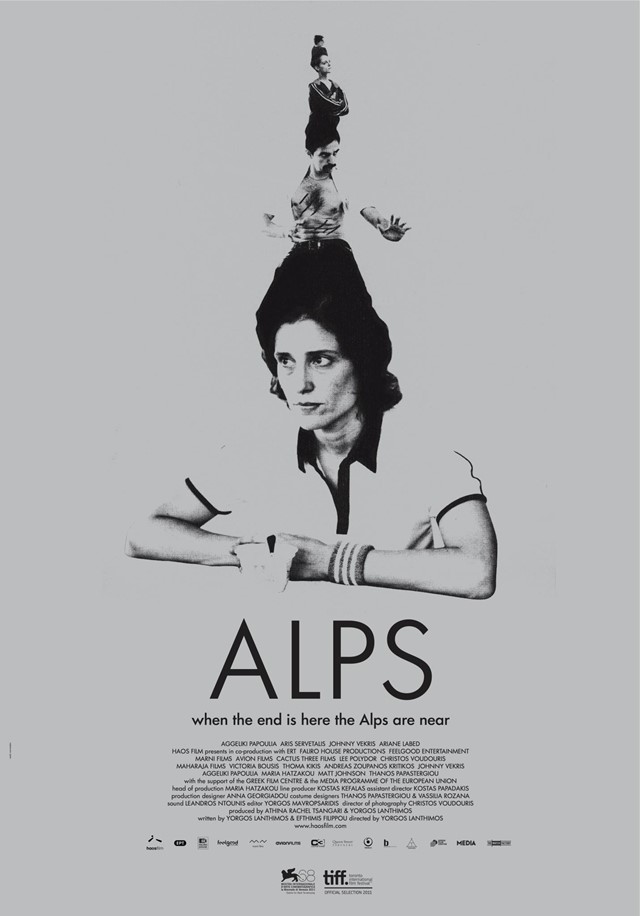
So this (Alps, above) is the official poster?
Vasilis Marmatakis: This is the one that came out. This was an idea to have a team of the Alps, all on top of the other, as if they’re part of a performance circus, like a satire. So that’s why he’s really tiny there.
I like it a lot, but it seems a bit more conventional than the other proposals?
Vasilis Marmatakis: I like it. The thing is, I never propose anything that I would not be happy with if it comes out. Because it’s very dangerous. All of these things that I propose, I would be happy if it comes out. And I wouldn’t call it completely conventional. Because it’s really dark. It’s one colour. It’s black. And it’s grey. Even the paper is grey.
%20%e2%80%93%20unused%20poster%20concept)
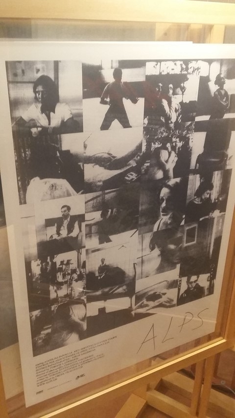
This one (Alps, above) didn’t come out?
Vasilis Marmatakis: The idea with Alps is that we have a group of people who pretend to be people who died – but they do it really badly. Also, Yorgos mentioned that Alps has a rough texture, the image, in relation with Dogtooth.
So I thought: “What if they would make a poster of themselves? And they make it themselves, really badly, and tried to make photocopies and distribute it?” So that’s the idea, and why it’s made like this.
%20%e2%80%93%20official%20poster)
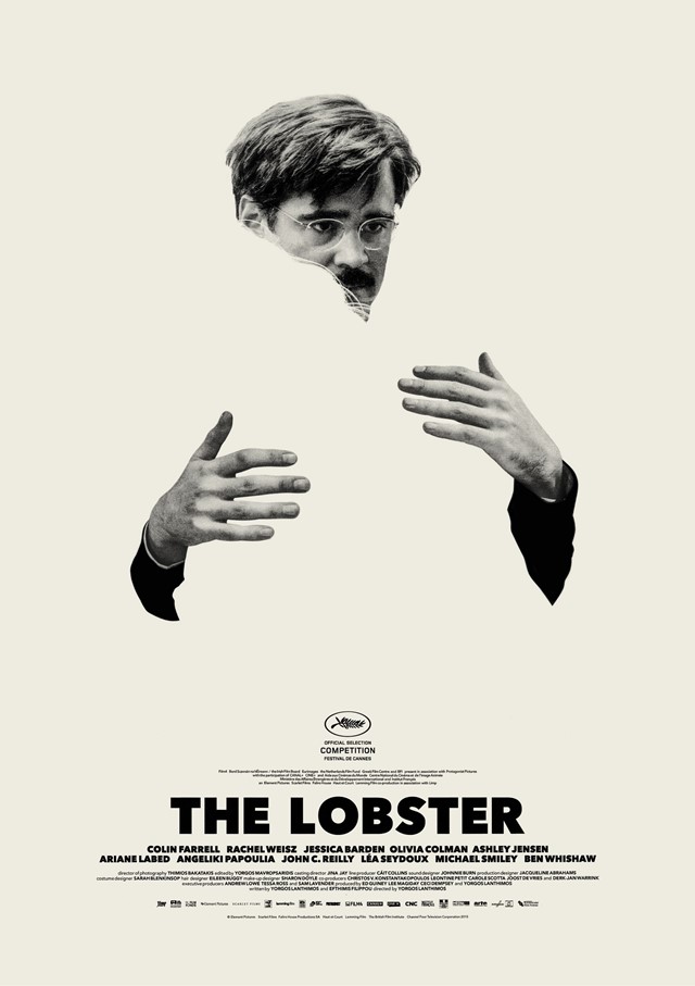
This (The Lobster, above) is another official one.
Vasilis Marmatakis: This is the one that came out. It’s about what it feels to be alone, and the need to be with someone, in the space.
Is there a lot of resistance to negative space? Sometimes negative space on a film poster creates the idea that the film couldn’t get critic quotes for it.
Vasilis Marmatakis: That’s a problem with the way I work, because I work a lot with negative space. When I send out the files, a lot of distributors think that that’s the space to put whatever – sponsors, critic quotes.
Do you have a say in that side of it?
Vasilis Marmatakis: Sometimes they send me the file. Sometimes I never see it. I might see it online (laughs).
%20%e2%80%93%20official%20poster)
It seems that you’re the only person who gets away with thought-provoking poster designs in the movie industry.
Vasilis Marmatakis: I really believe in these. I’m not trying to be provocative. These are what I think the films are about. Yorgos makes the kind of film that could have these posters. That’s very important. And also, he’s the one who really fights for it. Not a lot of directors deal with that. Yorgos really checks everything: the titles, the poster, the typography. He’s into that, and he really fights for it. Maybe other directors don’t fight for it.
%20%e2%80%93%20unused%20poster%20concept)
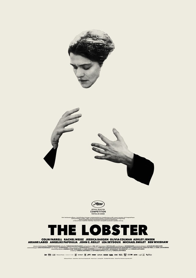
I think this one (The Lobster, above) is my favourite.
Vasilis Marmatakis: This was another proposal. This was the idea that Colin Farrell is in love with the idea of himself being in love. When you fantasise yourself being with someone in your life, (you’re) falling in love with the idea. So it’s him being in love with him being in love with him being in love. And it creates this weird space.
%20%e2%80%93%20unused%20poster%20concept)
I needed this one (The Lobster, above) explained to me. I didn’t get it at first. But now I can’t unsee it.
Vasilis Marmatakis: This is the one I really love. This is my favourite poster that never came out. If you look at it, you’ll see there’s an extra hand there. It’s the idea of what it means to be a couple. What it means when you’re holding someone’s hand, and if physically they’re there or not. Of if you hold someone’s hand, but no one is there.
The problem with The Lobster, for me, was that I found out very late in production that I couldn’t just have Colin Farrell. Wherever Colin Farrell was, Rachel Weisz had to be, because of contracts. So we had to design sets of posters. (Shows a corresponding poster of Weisz also holding a disembodied hand.) They would have to be placed near each other. And of course, these would never work to have them two together.
%20%e2%80%93%20unused%20poster%20concept)

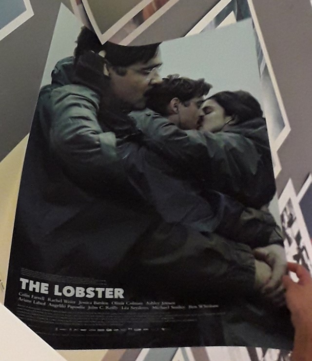
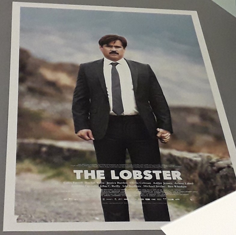
What’s the story behind this one (The Lobster, above)?
Vasilis Marmatakis: This was the first poster designed for The Lobster. Even before they started filming, this was the poster used to get funding for the film. That’s why it says “A love story set in a dystopia where finding love is a matter of life and death.”
%20%e2%80%93%20official%20poster)
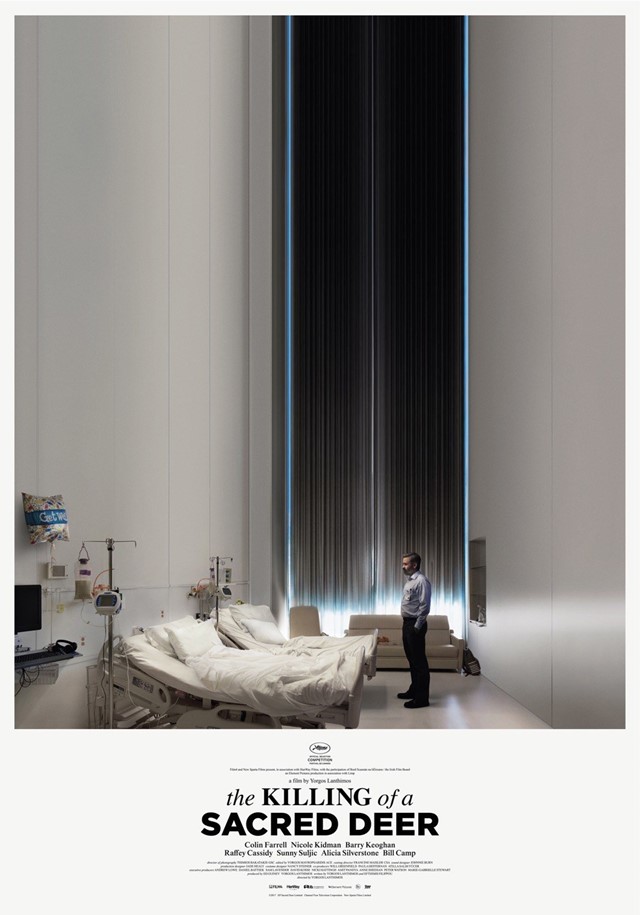
I remember this one (The Killing of a Sacred Deer, above) having a big impact when it came out.
Vasilis Marmatakis: I really like this one. This one has to do with the feeling you might have in a hospital, when you have to make a decision. You’re in a hospital, and you feel completely helpless, and you feel the whole world is sinking in. You’re in a deep well, and there’s no way out.
Obviously, he has to make a decision with these two empty beds. He’s facing a dilemma. I’m trying to picture that. Also, there’s a metaphysical edge. The whole film is kind of metaphysical as well. There’s this threat. You don’t know where it’s coming from.
%20%e2%80%93%20official%20poster)
You have these two massively famous A-listers who were probably essential for funding, and then there’s this younger actor who plays the film’s most memorable character. Is it tricky balancing these demands?
Vasilis Marmatakis: When I work, only at the back of my mind do I think, “Who is the star and who is not? Who is going to be big?” For example, with Deer, Nicole Kidman isn’t even in the other poster. It wouldn’t work if she was there. (Farrell) had to be alone.
So this one, (Barry Keoghan)’s hanging under them, as if he’s a bat, or an animal, or something out of this world, as if he has no skin. It’s quite dark. Quite scary, even.
%20%e2%80%93%20official%20poster)
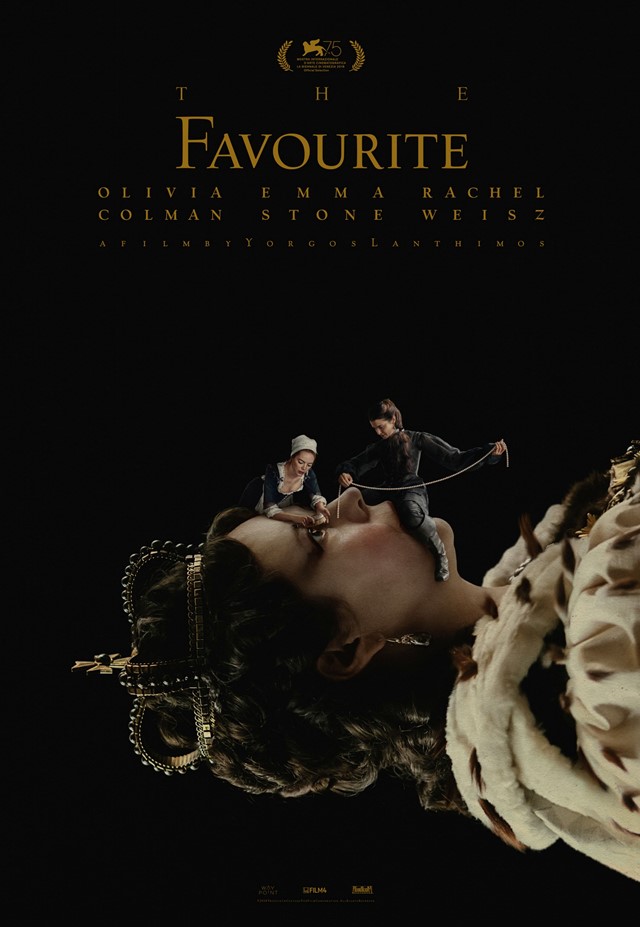
Is this the main poster (for The Favourite, above)?
Vasilis Marmatakis: This is the main one in the UK. It’s an image of the Queen, (like) the classic image that you get on post stamps. You have two insects. (Emma Stone is) about to brush her eyeball, which is quite hard, and (Rachel Weisz)’s about to decorate her with pearls, as if they’re both manipulating a dead body. Which is, in a way, the film.
The Favourite is out in UK cinemas now